Most home color schemes fail because the same shade can look warm in one room and flat in the next. You can avoid that surprise by checking natural light initially, then choosing a base color that links connected spaces. From there, you’ll want to repeat accent tones in small places, match colors to furniture and trim, and test samples at different times of day, since the right wall color can quietly change the whole mood of your home.
What Creates a Cohesive Color Scheme?
A cohesive color scheme starts with a clear plan, and that plan begins with choosing colors that share the same mood and work well together.
You can build trust in the room once you compare color undertones, because a soft blue with a cool gray feels steady, while a warm beige with cream feels gentle and welcoming.
Next, check finish compatibility, since matte walls and glossy trim need to support each other instead of fighting for attention.
Then repeat one or two shades in your fabrics, art, or pillows so the space feels connected.
You don’t need every piece to match exactly. Instead, you want a steady rhythm that helps the room feel calm, friendly, and like it truly belongs to you.
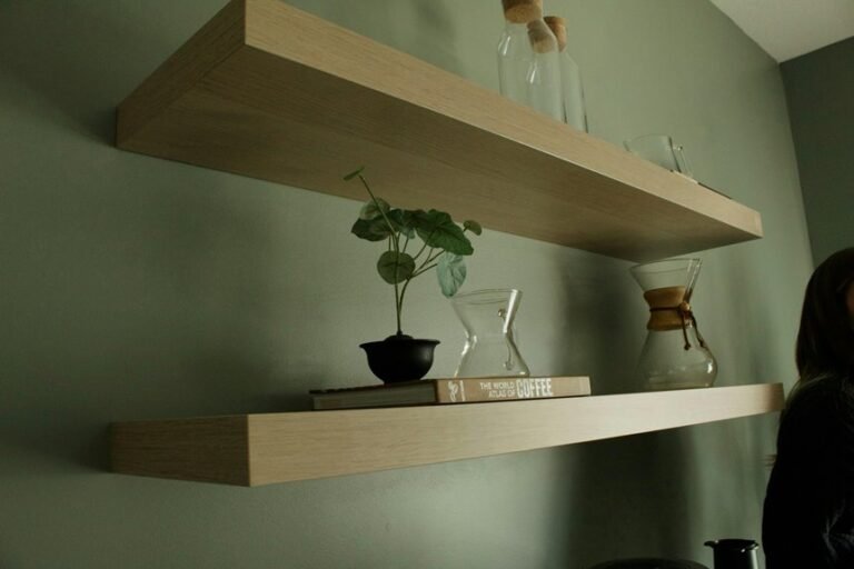
Start With Natural Light
Natural light should shape your color choices before you commit to paint, because the same shade can look soft and warm in one room and sharp or dull in another. You need to notice the window orientation impact initially. North-facing rooms often feel cooler, so colors might seem quieter.
South-facing rooms usually pour in steady light, which can lift most shades. East light changes fast in the morning, and west light can turn richer at evening. Watch daylight color shifts at different times, and sample paint on several walls.
Then you can choose tones that feel welcoming from breakfast to bedtime. At the moment you read the light this way, your home starts to feel more like it truly belongs to you.
Balance Warm and Cool Tones
Warm and cool tones work best while they support each other instead of fighting for attention. You can create temperature balance in mixed palettes with pairing a calm blue wall with a warm wood chair, or a soft cream rug with navy pillows. That mix helps your rooms feel friendly, steady, and lived in.
Whenever you focus on integrating warm and cool accents, repeat each tone in small ways, like metal lamps, artwork, or throw blankets, so the room feels connected. Warm reds and oranges bring energy, while blues and greens ease the mood, so you get both comfort and spark. Keep one tone slightly louder, then let the other play backup. That way, your space feels inviting, not awkward, and you’ll fit right in.
Choose a Base Color for Connected Spaces
When you choose one base color for connected spaces, you give your home a steady visual flow that feels calm and easy to follow.
A neutral anchor shade like soft white, beige, or gray can tie your open-plan rooms together without making them feel flat.
In connecting rooms, repeat that same color in small ways so each space feels linked, not chopped up.
Open-Plan Color Flow
A good open-plan color flow starts with one base color that can carry you from room to room without visual chaos. You can use it to link the kitchen, dining area, and habitat space so each zone feels connected.
Then, build color zoning strategies with nearby shades that shift gently from warm to cool or soft to deeper tones. This keeps visual sightline continuity strong, so your eye travels easily across the whole layout.
Repeat the base color in rugs, pillows, cabinets, or a painted chair to make the space feel like it belongs together. Should you add one bold accent, let it appear in small doses in each area. That way, your open plan feels welcoming, calm, and easy to dwell in.
Neutral Anchor Shade
Picking a neutral anchor shade makes the whole space feel steady, and it also gives your earlier color flow a calm place to land. You can choose soft gray, warm beige, cream, or gentle taupe as your neutral foundation. This calming backdrop lets each room keep its own personality without feeling separate.
Whenever you repeat that base color on walls, trim, or large furniture, you help connected spaces feel like they belong together. Then your brighter accents can shine without crowding the eye. You’ll also find it easier to mix textures, because a quiet neutral supports wood, fabric, metal, and stone.
Should you want your home to feel welcoming and settled, start here. A balanced base can make everyone relax a little faster, even on busy days.
Transition Room Continuity
From the initial step into a hallway, your base color can make every room feel linked and easy to live in.
Choose one calm shade, then let it guide the entryway color bridge from the front door to the main rooms.
A soft cream, muted blue, or warm gray works well because it gives your eye a rest and helps each space belong to the next.
Use your hallway transition palette to repeat that color in trim, art, rugs, or a painted console.
Then shift only a little in nearby rooms so the move feels smooth, not sudden.
Should your home needs more warmth, add gentle terracotta or beige.
Should you want quiet focus, lean into cool blue-green tones.
Repeat Accent Colors Throughout the Home
Whenever you repeat accent colors throughout your home, you give the whole space a quiet sense of connection that feels intentional, not forced. You help each room recognize the next, so your home feels welcoming instead of scattered. Use accent repetition strategies to echo a color in pillows, art, lamps, or a vase, then shift the tone or amount from room to room. That way, you keep things fresh while still feeling familiar.
- Place a bold accent in one room, then soften it nearby.
- Repeat the same hue in small details, like frames or textiles.
- Vary accent color placement so the eye keeps moving with ease.
As you do this, you build belonging through simple, thoughtful choices that quietly say, you fit here.
Match Paint Colors to Fixed Finishes
You can make your paint feel intentional when you match it to the finishes that stay put, like flooring, trim, and tile.
Start by choosing a wall color that works with your floor’s undertone, then use trim paint that blends cleanly instead of fighting it.
When your fixed finishes already set the tone, your paint can tie everything together with far less guesswork.
Coordinate With Flooring
Because flooring stays put, it should guide your paint choice, not fight it. You’ll feel more at home when the floor and walls share the same mood. Start with a flooring undertone pairing that respects the wood, stone, or tile already there. Then test samples in daylight and evening light so the color feels right all day.
- If your floor runs warm, choose cream, beige, or soft clay.
- If your floor leans cool, try gray, misty blue, or sage.
- If you want easy flow, use rug and floor harmony to bridge both.
When you repeat one tone in paint, fabric, or art, the room feels joined together. That calm unity helps you relax and belong, without making every surface shout for attention.
Blend Trim And Tile
Trim and tile can make a room feel polished fast, but only when your paint gives them a good partner.
You can read the room via checking trim profiles and sheen initially, since sharp molding wants clean, crisp paint while softer profiles feel better with gentler tones.
Then look at the tile grout contrast, because strong grout lines can handle a bolder wall color, while quiet grout often needs a softer shade to keep things balanced.
Whether your tile feels cool and busy, choose a warm neutral to steady the space.
Whether your trim already stands out, let paint support it instead of fighting it.
That way, your room feels connected, welcoming, and easy to live in.
How Room Size Affects Paint Color?
Room size changes how paint color feels, so the same shade can look soft and airy in one room and heavy in another. You can use that shift to make your home feel more like your own circle. In tight spaces, small rooms and light colors help walls seem farther apart, and they keep the mood easy. In open areas, large rooms and bold colors add warmth and keep the space from feeling empty.
- Choose pale tones for cozy rooms so they breathe.
- Pick deeper hues in big rooms so they feel grounded.
- Test samples in morning and night light before you decide.
When you match color to scale, you create comfort, and that makes it easier to relax where you live.
Coordinate Trim, Ceilings, and Doors
When you coordinate trim, ceilings, and doors, you give your home a calm, finished look that ties every room together.
Start with your trim color, then carry that choice to the ceiling for ceiling finish coordination that feels steady and intentional. A soft white can open the room, while a warmer shade can make it feel welcoming.
Next, consider door trim contrast. Should you want your doors to stand out, use a deeper tone around them. Should you prefer unity, keep doors close to the wall color.
This simple balance helps you feel at ease in your space and makes each room seem like it belongs.
Small details matter, and your home notices when they work together.
Soften Bold Colors With Texture
Through texture, even a bold color can feel easier to live with. You don’t have to mute the shade; you can layer it so it feels warm and welcoming. Consider of a red chair, then soften it with colorful textiles for balance and a nubby throw. The mix helps you join the room instead of fighting it.
Use these moves:
- Add textured finishes for depth on walls, lamps, or furniture.
- Pair smooth paint with woven rugs or linen curtains.
- Repeat the bold hue in smaller touches so it feels friendly.
When you do this, your space keeps its energy, but it also feels settled. That balance matters because you want a room that supports you and still has personality.
Choose Neutrals With Character
Neutrals can do a lot more than sit quietly in the background, and that’s why they’re such a smart choice for a home that still feels alive. You can build warmth with textured neutrals, then let character rich taupes add depth without making the room feel heavy. Whenever you choose shades with soft variation, you make your space feel welcoming and easy to settle into.
| Neutral choice | What it brings |
|---|---|
| Linen white | Light and ease |
| Greige | Soft balance |
| Taupe | Cozy character |
You don’t need perfect sameness. Instead, mix matte, woven, or brushed finishes so each surface feels friendly and full of life. That little bit of movement helps you feel like you belong there, not like you’re just passing through.
Coordinate Colors With Furniture
You can make your room feel pulled together using matching fabric undertones with your sofa, chairs, and curtains.
Then balance wood tones so they support each other instead of fighting for attention.
Finally, echo a few accent pieces in pillows, lamps, or art so the whole space feels calm and intentional.
Match Fabric Undertones
Whenever your sofa, chairs, and curtains already share a color family, matching fabric undertones can make the whole room feel calm instead of chaotic. While you study fabric swatch undertones, you spot warm, cool, or neutral clues that shape how each piece feels beside the next. That’s the heart of textile color matching, and it helps you belong to a room that looks thoughtfully put together.
- Hold swatches together in daylight.
- Compare the concealed tint, not just the main color.
- Repeat that undertone in pillows or throws for unity.
If one fabric leans rosy and another leans beige, they might clash even while both seem cream. So trust your eye, stay patient, and let the room greet you with ease.
Balance Wood Tones
Because wood tones can either calm a room or make it feel busy, start at reading the furniture’s undertone before you pick wall colors, rugs, or fabrics.
You’ll spot warmth in honey oak, red in cherry, and cool depth in walnut. As soon as you match those notes, you build wood tone harmony and make the room feel like it belongs to you.
Whenever your pieces mix, keep one tone dominant and let the other support it with softer paint and neutral textiles. For balancing oak and walnut, choose colors that bridge both, such as cream, muted green, or soft gray.
Then repeat that choice in nearby surfaces. This gives your space a steady, welcoming rhythm without forcing every piece to look alike.
Echo Accent Pieces
Start with one accent color that already appears in your furniture, and let it echo through the room in small, calm doses. This helps you feel at home, not staged. Whenever you choose echo accent pieces, you build a soft thread that ties chairs, pillows, and lamps together.
- Repeat decorative accents in a throw, vase, or frame.
- Use one metal finish, like brass or black, on small items.
- Place the color in more than one zone, so your eye moves easily.
You don’t need a perfect match. Slight shifts in shade feel warmer and more human. When your sofa has blue piping, echo it in a bowl or art print. That quiet rhythm makes the room feel welcoming, like it knows your name.
Build Flow From Room to Room
Should you want your home to feel calm and connected, the colors in each room need to speak to one another. You can guide that conversation with hallway color shifts, using a soft bridge color that eases you from one space into the next.
Then, keep an adjoining room palette rhythm via repeating one shade in a new way, like a wall color in the family room and a cushion in the dining area. You don’t need perfect matches; you need shared family traits. Whenever you weave in neutrals, gentle pastels, or one bold accent, your rooms feel like they belong together. This flow helps guests relax, and it helps you feel settled every time you walk through your home.
Test Paint Samples at Different Times of Day
What does a paint color really look like once the sun and lamps take turns on it? You find out when you test sample boards in real rooms, not just under store lights. Move them around as light shifts through morning, noon, and night. Then you’ll see whether the shade still feels right.
- Tape sample boards near trim, furniture, and windows.
- Check them again after sunset, when lamps warm the walls.
- Look for surprise undertones that show up later.
This small step helps you feel at home with your choice, because color can change fast. When you give it time, you avoid that “wait, that’s not what I picked” moment. Instead, you pick with confidence and join the room, not fight it.
Match Colors to Mood and Function
When you match colors to mood and function, your home feels more helpful and more like you. You can use mood based color pairing to shape how each room feels.
Soft blues, greens, and creams help bedrooms stay calm and restful. In a home office, muted green or bright yellow can support focus without feeling stiff.
For gathering spaces, warm reds and oranges invite conversation and make people linger a little longer. Next, use function driven palette selection to connect color with daily use.
Choose monochromatic blues for study corners, pastels for a gentle residing room, and neutrals to calm bold accents. When you link color to purpose, your rooms feel welcoming, useful, and easy to belong in.
Frequently Asked Questions
How Do Monochromatic Schemes Affect a Room’s Atmosphere?
Monochromatic schemes create a calm, serene atmosphere. Layering similar tones adds depth without visual noise, while varied textures tie the room together and give it a cohesive, welcoming, grounded feel.
Which Colors Work Best for Bedrooms and Home Offices?
Soft blues, sage greens, and restful neutrals help bedrooms feel calm and settled, while muted greens and touches of yellow support concentration in home offices. These colors create a peaceful atmosphere for sleep and a clearer setting for work.
How Can Exterior Colors Influence Interior Room Choices?
You can use your exterior to shape interior decisions by following curb appeal details and carrying siding, trim, and door colors into your rooms so the whole home feels connected, welcoming, and distinctly yours.
What Color Harmonies Prevent Clashing in Open Floor Plans?
Analogous and monochromatic palettes reduce visual conflict, while repeated accent colors and subtle tonal changes guide the eye from one area to the next. Neutral shades can bridge adjoining spaces and help the whole open floor plan feel unified and inviting.
How Do Complementary Colors Add Energy Without Overwhelming Spaces?
Complementary colors can bring lift without taking over. Use a 70 percent neutral base and 30 percent bold accents to keep the room steady. Soften the accent saturation to tune the color strength, making the space feel vivid, welcoming, and distinctly personal.